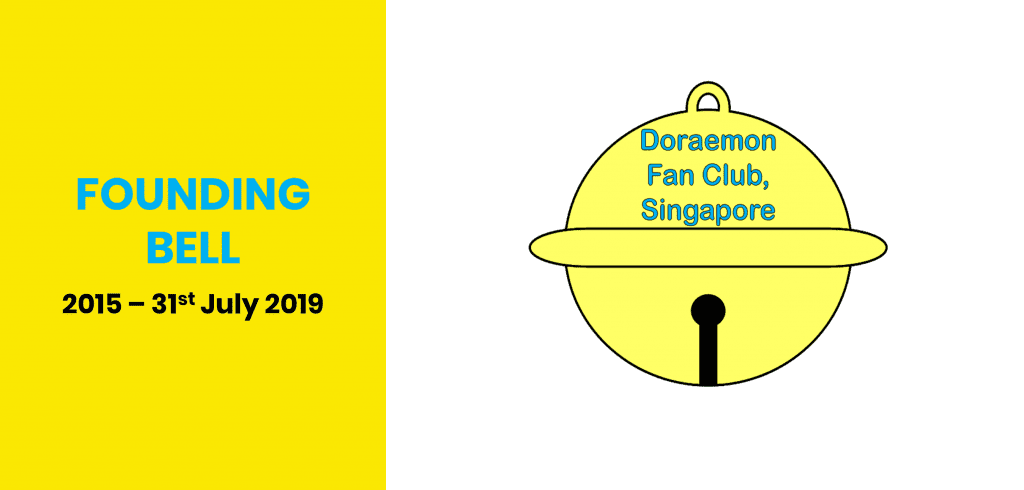
11th June 2015 – 31st July 2019
The club’s colours are Blue and Yellow, which are based off the original colours of Doraemon.
Yellow represents positivity, hope and happiness. This captures the club’s vision of wanting to be the main source of Doraemon-related happenings and reach out to the fans’ in a vibrant way. It also seeks to symbolise the warm and vibrant culture of the club members.
Blue represents trust, loyalty and confidence. We hope to sustain our efforts of the club in Singapore and maintain the same image that Doraemon present to its viewers.
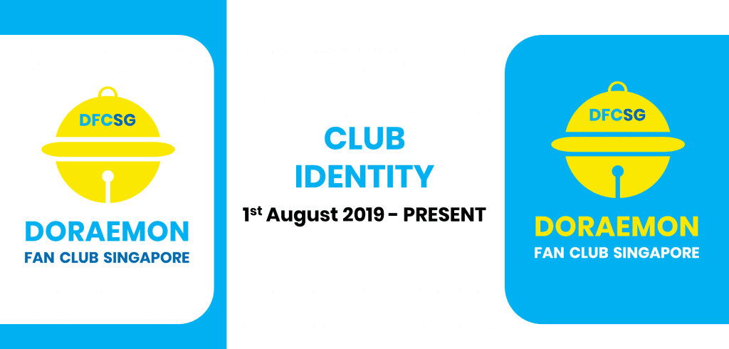
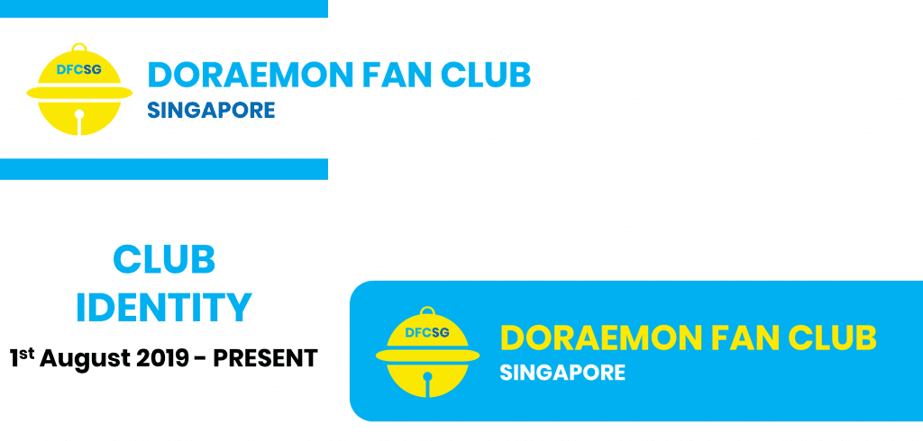
1st August 2019 – Present
With effect from 1st August 2019, the club’s rebranding efforts commenced. A new club logo was introduced on the same date and progressively rolled out to all of the club’s platforms. The rebrand brought a new face of the club while retaining the essence of the original logo. The rebrand signifies the club’s continued effort in collaborating with our valued sponsors and improving the club appeal to newer fans. The essence of the original logo was retained to remind us of what started the club, and we will always remember the what was the club’s goal when it was founded.